The Principles of Design
When it comes to design, there are rules that every designer must follow to create compelling and visually exciting compositions. The seven principles of design are Emphasis, Balance and Alignment, Contrast, Repetition, Proportion, Movement, and White Space. Graphic design is everywhere, and as opposed to art, a design must have a purpose. In visual terms, this functionality is interpreted by ensuring that an image is the center of attention or a point of focus. As with any discipline, graphic design adheres to strict rules to maintain stability and balance. Ineffective and weak designs need more balance.

Emphasis
The first principle of design is emphasis. Emphasis refers to the focus of a design and the order of importance of each element within the design. Emphasis places importance, prominence, or value on specific design elements. Emphasis is an excellent tool for pulling
viewers; attention to something important in a design. Emphasis says, “look at me,” and gives cues on why the viewer should be looking
at that thing.
Balance and Alignment
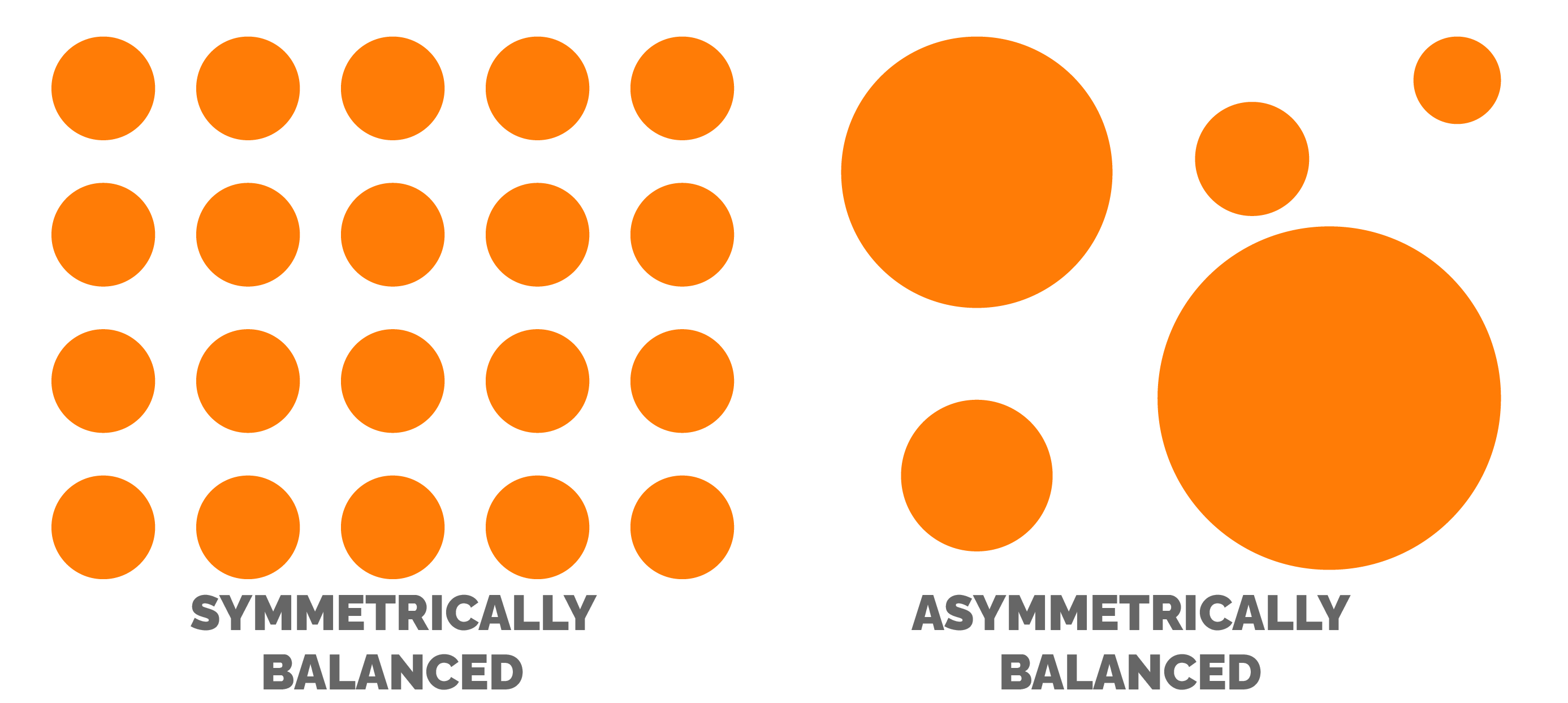
The second principle of design is balance and alignment. Every element of a design has weight. It can come from color, size, or texture. Balance is how each element is arranged within a composition. They can be arranged symmetrically or asymmetrically. A symmetrically balanced design is when parts of the design mirror itself. While asymmetrically balanced design occurs when you have different visual elements on either side of a design to achieve a sense of balance.
Contrast
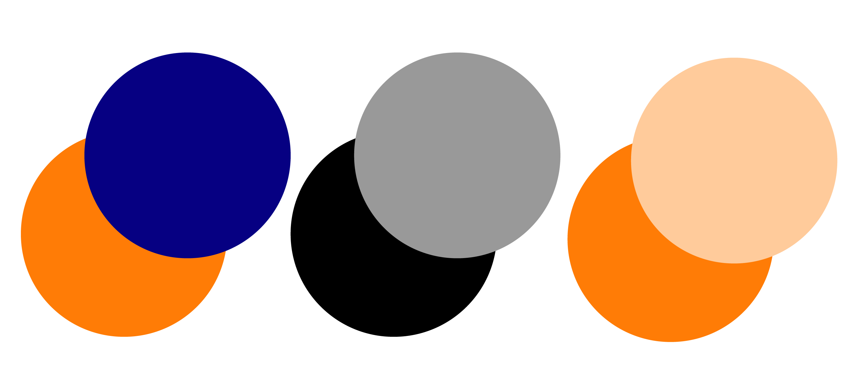
The next principle of design is contrast. Contrast in design refers to how different elements and things look. Contrast creates space and differences between elements in a design. For example, the background needs to be significantly different from the color of the other elements so that each works harmoniously together and is readable. Things that are not contrasting with each other tend to blend together and can make the readability suffer. Contrast can be created with white space or by placing two different colors side-by-side. Contrast is critical for the success of any design. It can help make the focal point of any design.

Repetitions
Repetition is the next principle of design. Repetition is when the same or similar elements are used again. Repetition is used to achieve consistency and uniqueness. Repetition of design can happen regularly while being even or uneven, regular or irregular. When it comes to repetition, it is essential to know that it should be limited. Too many different forms can hurt the usability and quality of the design. By repeating the same colors, shapes, or sizes of a particular design and achieving completeness of the cohesiveness of the design, it is
easily recognizable.
Proportions
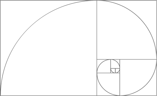
Proportion is the visual size and weight of elements in a design or composition and how they relate. Grouping related items can give them importance at a smaller size. Proportion can be achieved only if all design elements are well-sized and thoughtfully placed. Make sure that the most critical points on the design are large enough to stand out to be seen at a moment’s notice but not so large that they overpower everything else. Proportion is excellent for keeping the design harmonious. Also, proportion is based on context and relationship. The Golden Ratio is the perfect example of how proportion is used.
Movement
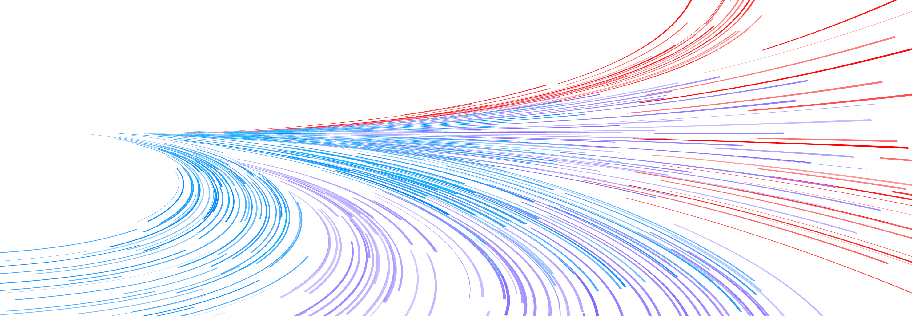
Movement is the path a viewer’s eye takes through a composition. It often points to the focal areas of the design. Designers often use diagonal or curved lines to control movement and keep the viewer’s eye engaged. Lines, arrows, and text are the most specific graphic elements that create movement. Some less direct elements are curves, progression, and color spectrums can be another way to
create movement.
White Space
The final principle of design is white space. White space is also known as negative space. This is an essential principle of design. White space is exactly what it sounds like. It is the empty space in a design. Lack of white space can make an otherwise good design busy and take away from the focal points. White space can help create hierarchy and contrast.
Understanding and using these seven elements can change any good design to a great design. These principles help the important information stand out and support the viewer in understanding what is being communicated. But sometimes, breaking the rules of these principles can create unique designs when justified. Before breaking the principle, you need to know how to use them.
Good designs are not created just by understanding the principles. A designer must also understand the elements of design. Check out my article about The Elements of Design to learn what and how to use them.
← Understanding Logo File Formats
The Elements of Typography →
