The Casuals and Company
Branding | Logo Identity and Twitch Assets
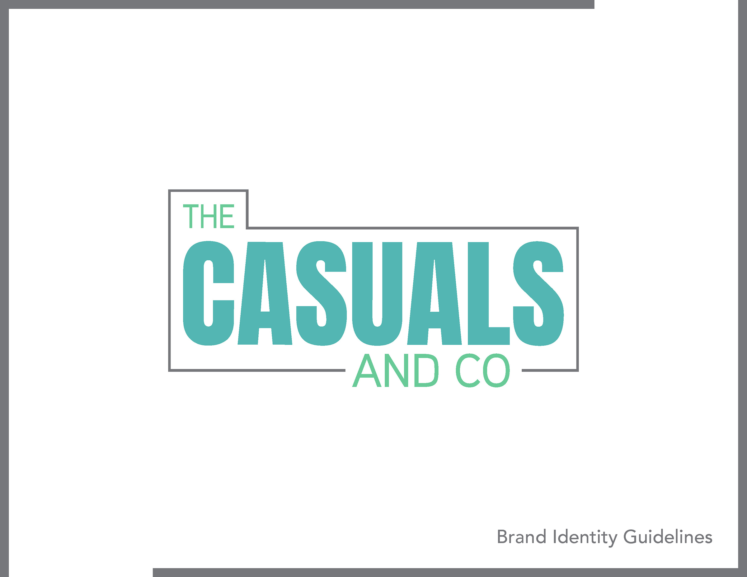
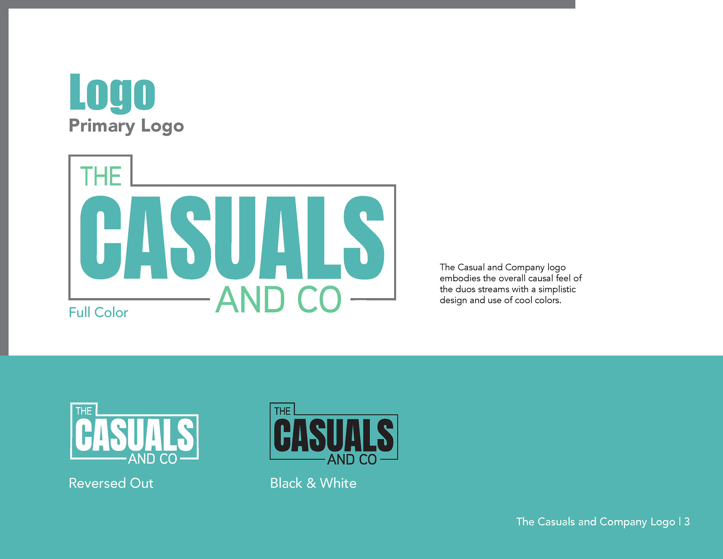
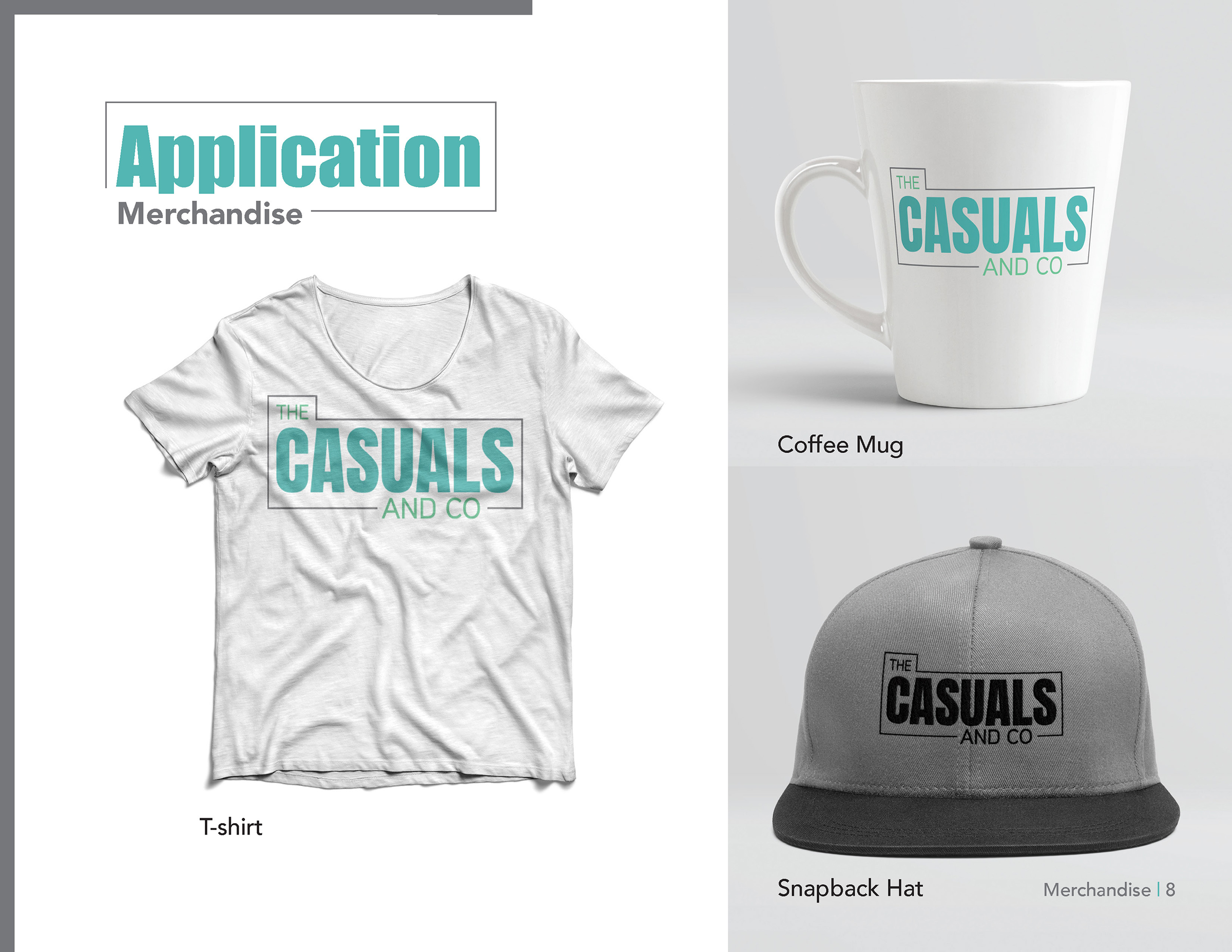
The Casuals and Company is a Twitch channel started by two friends, Jordan Dennis and Sylar Skotschir. They are a small channel that began in 2019 because of their shared love of video games. Their original logo is not something they felt represented them and was outdated and clunky. Their new logo is more modern to represent their channel and personalities better.
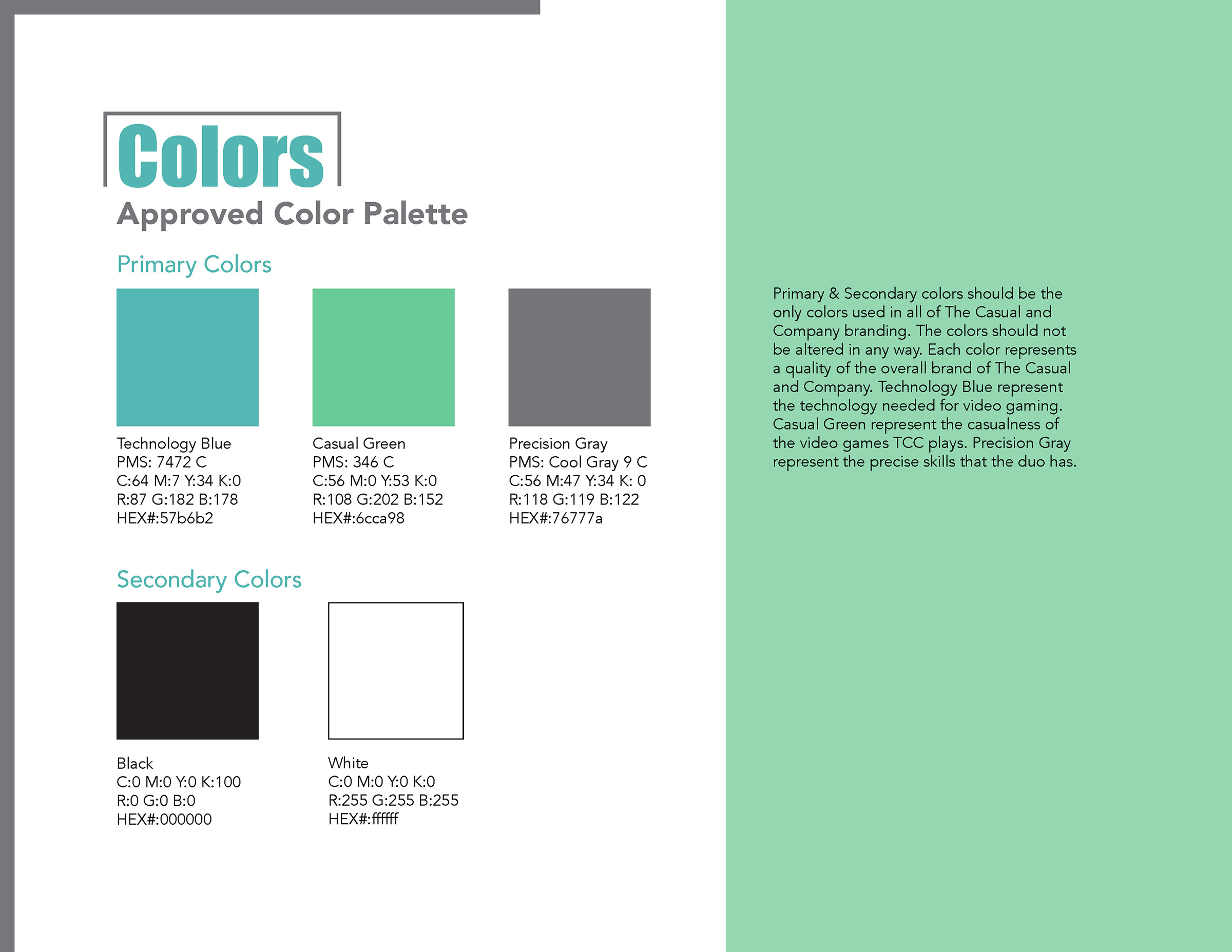
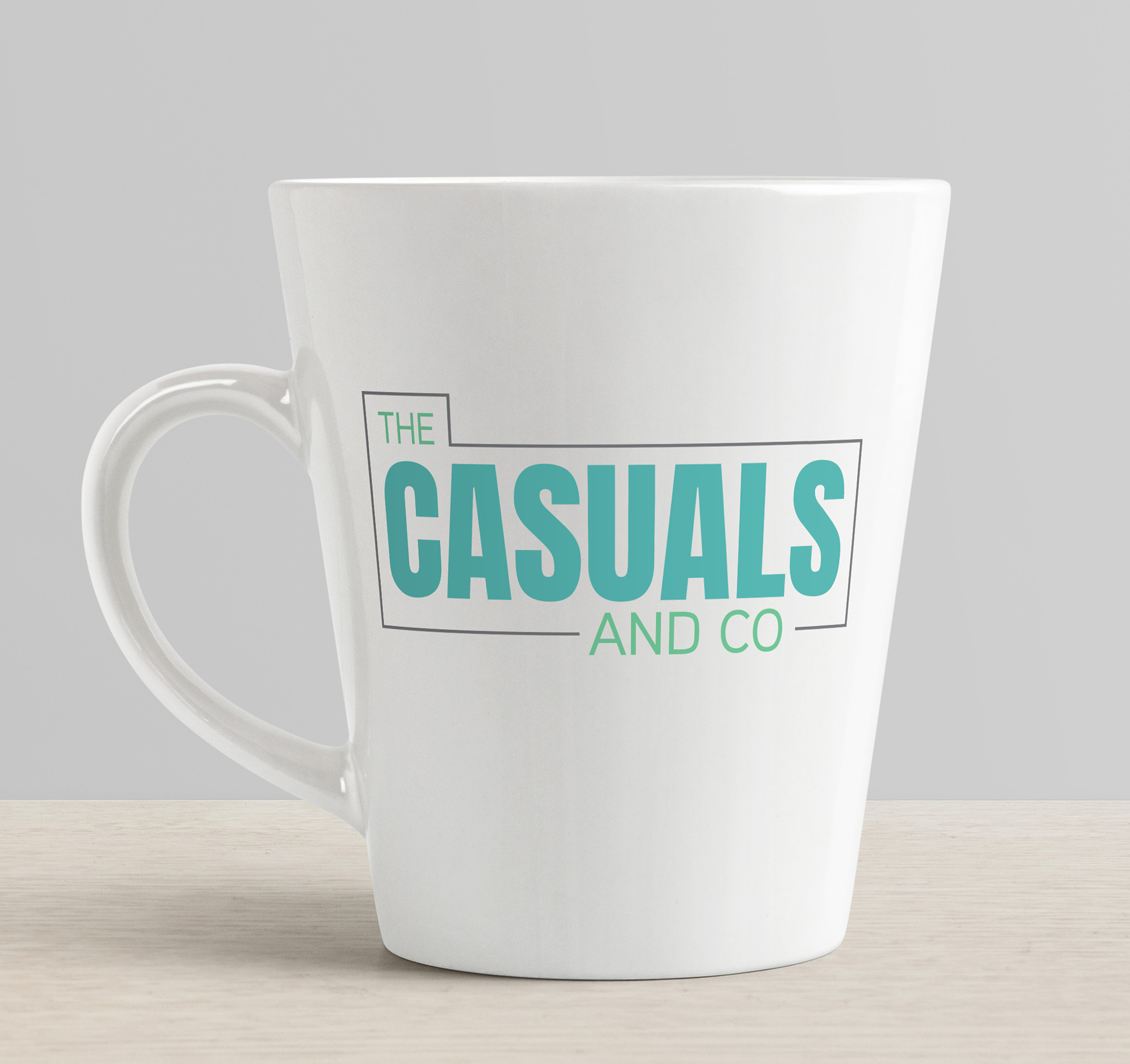
The bright colors and thick lines are used to gain the more tech and modern feel they wanted. The logo is calm and straightforward in a way that represents the overall feeling of their streams. Blue represents the calmness of their stream and the technology needed for the stream. The green represents the casualness of the video games they chose to play. Finally, the gray represents the duo’s precision while playing
video games.
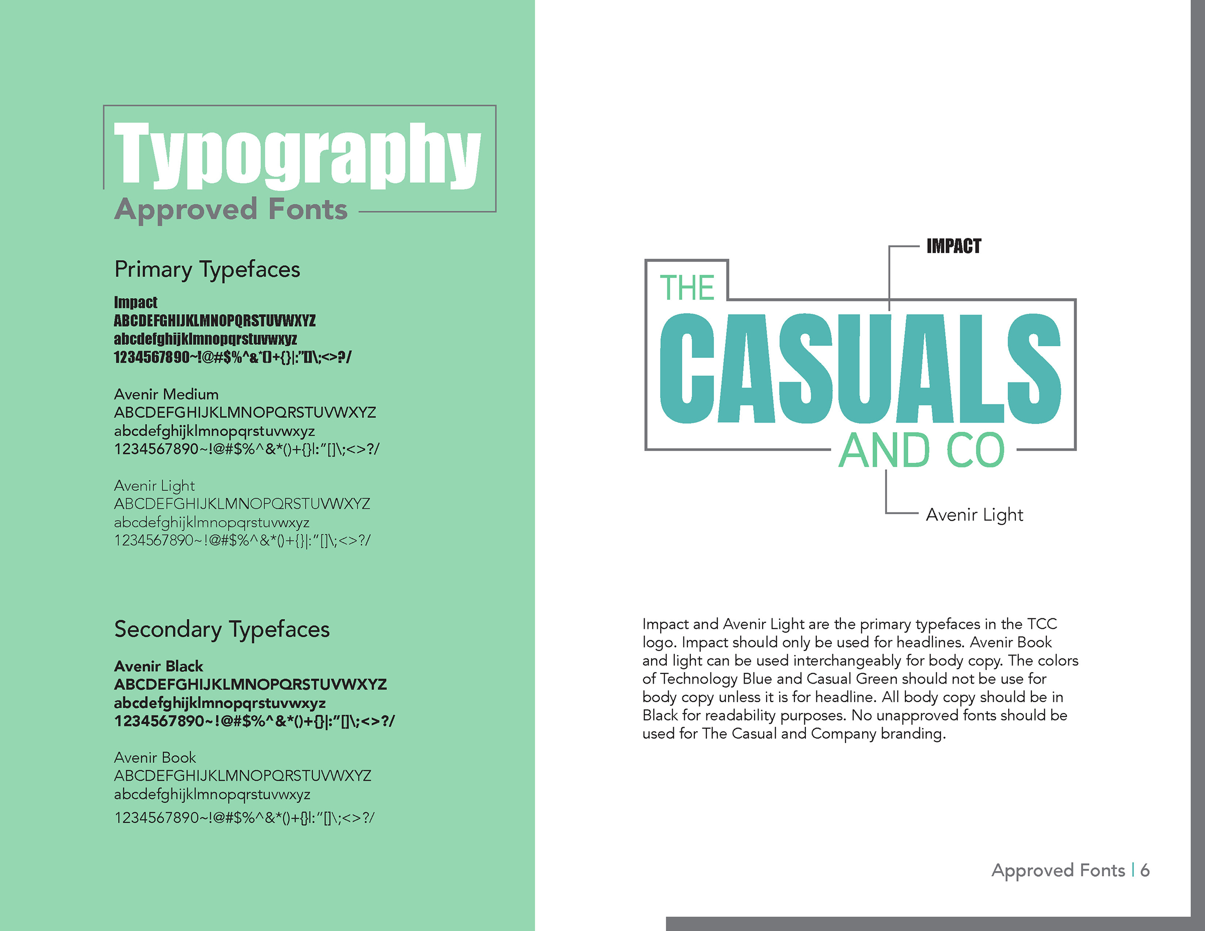
The typeface Impact represents the prominent personalities of the two friends. They are not afraid to stand up for what they believe in and discuss topics in their streams that are important to them. When it comes to the new logo’s design, the line around the text of the logo represents not only the chords associated with technology and video games but also the LED light strip they often have in the background of their face camera on their streams. The most important part of their logo is the word “CASUALS,” which is not only shown with the use of hierarchy but also by it being surrounded by the line. The casualness of their stream is the most crucial part of the pair, so emphasizing the word is essential to them.
Type & Color Study

The Casuals and Company’s Original Logo
Sketches

Logo Application


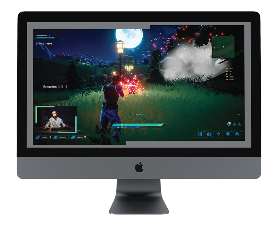
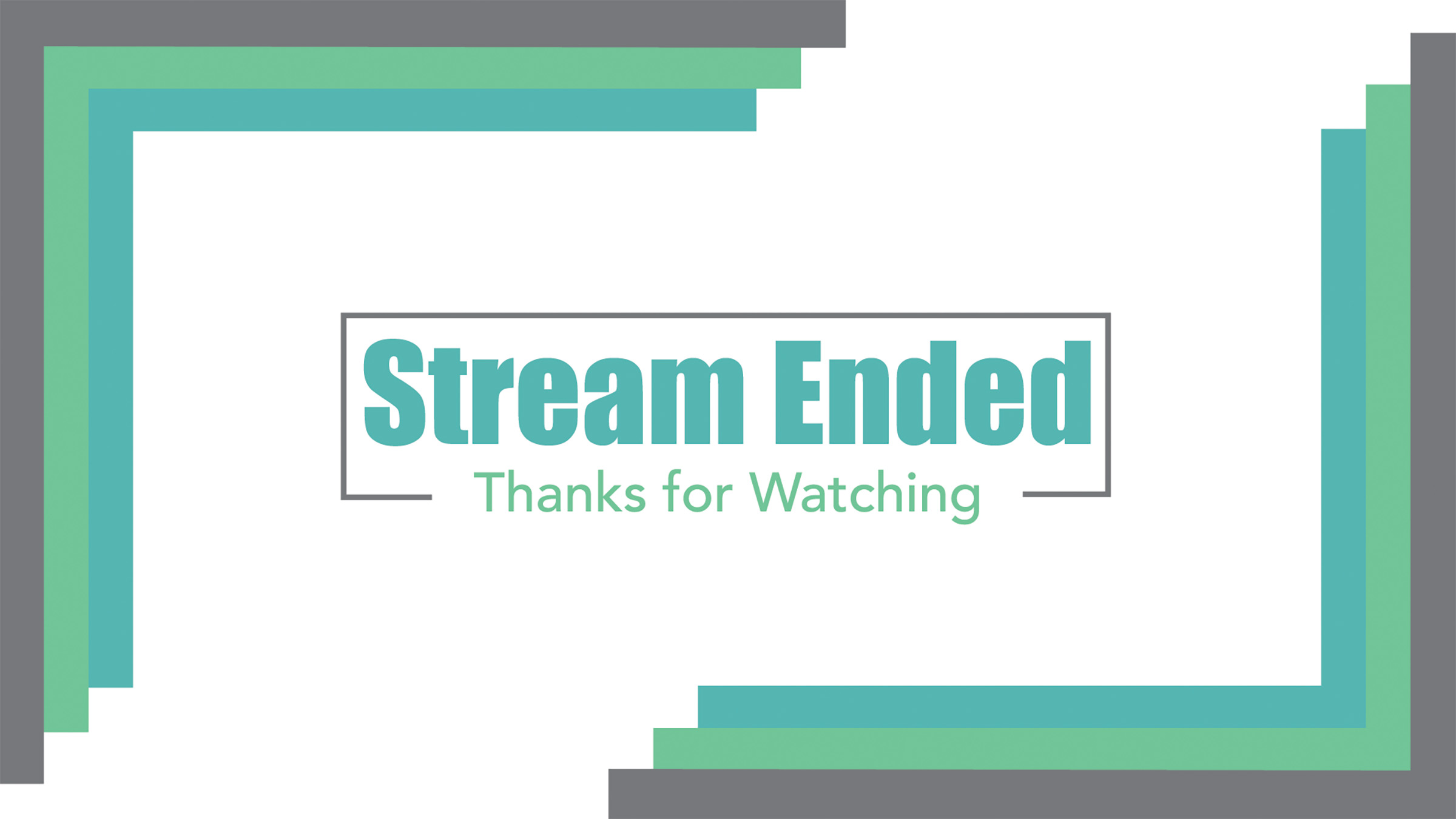
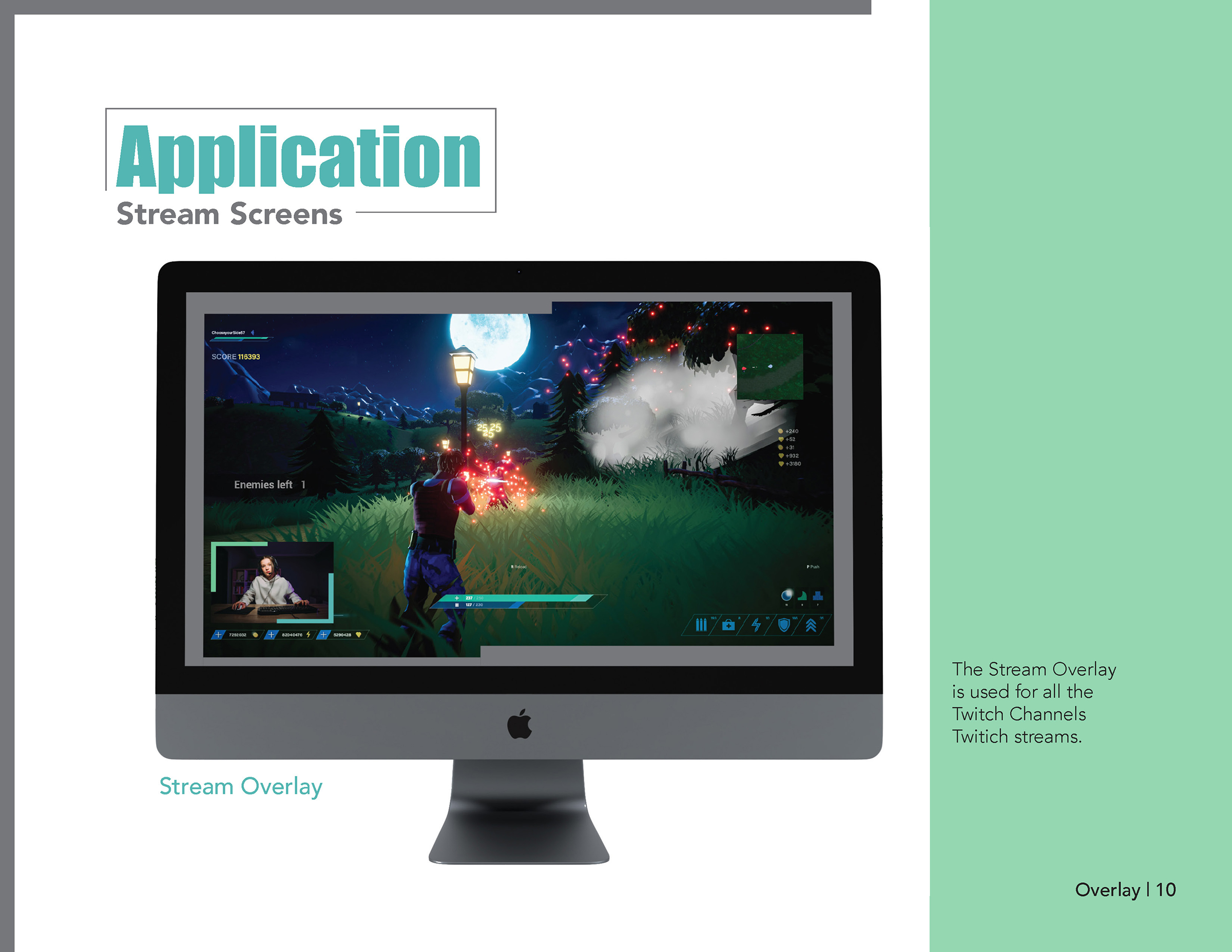
Stream Screens
