Bridge the Gap Brochure
Print Design | Double Gate Fold Brochure
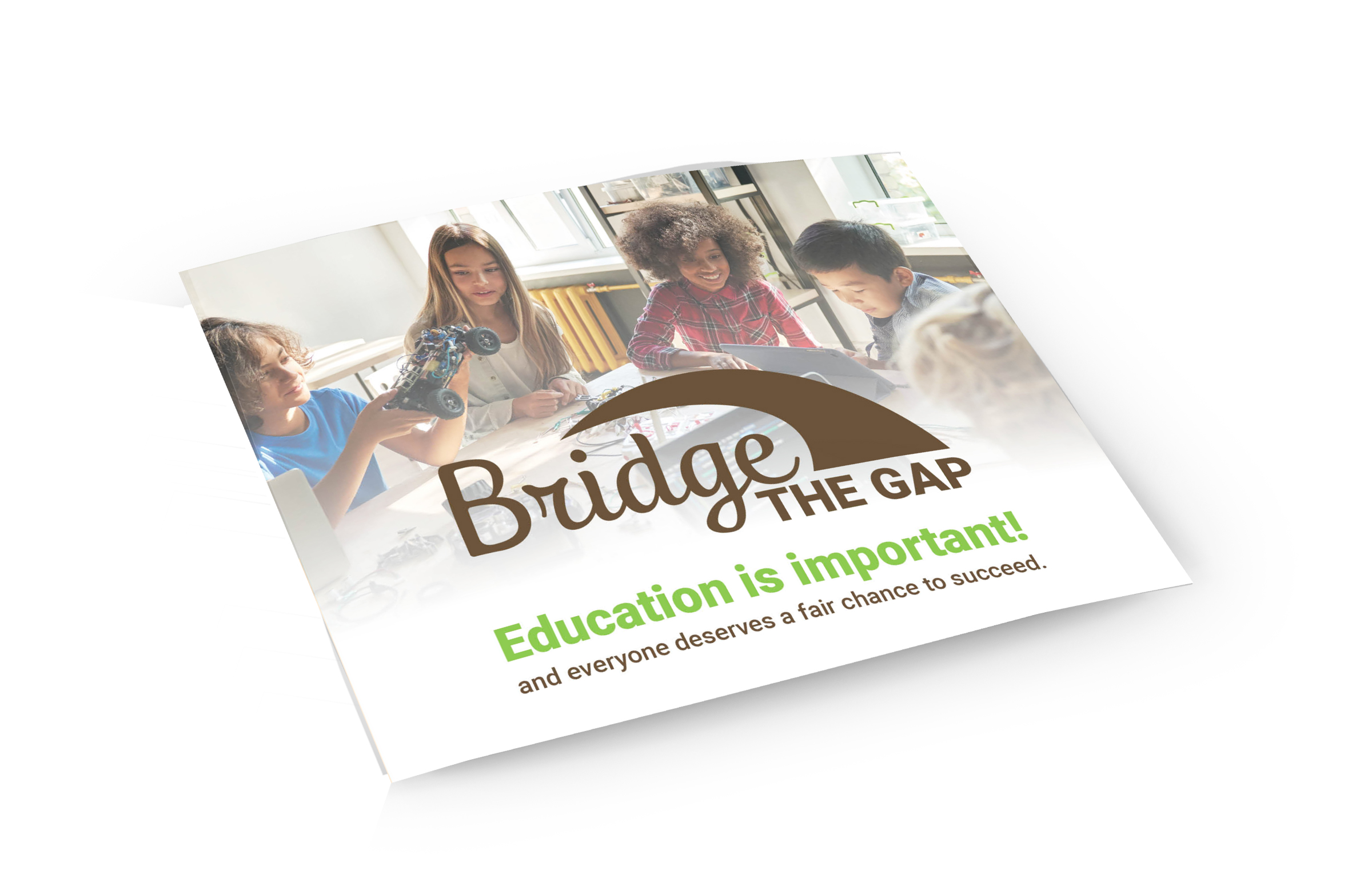
Bridge the Gap is a non-profit organization that believes every child has a right to education. We focus on providing access to technology for schools in rural areas. Our logo symbolizes closing the gap in education access with a curved line connecting “the gap” to the “bridge.” The brown and green colors reflect rural Ohio’s natural landscapes and represent values such as solidarity, reliability, and growth.
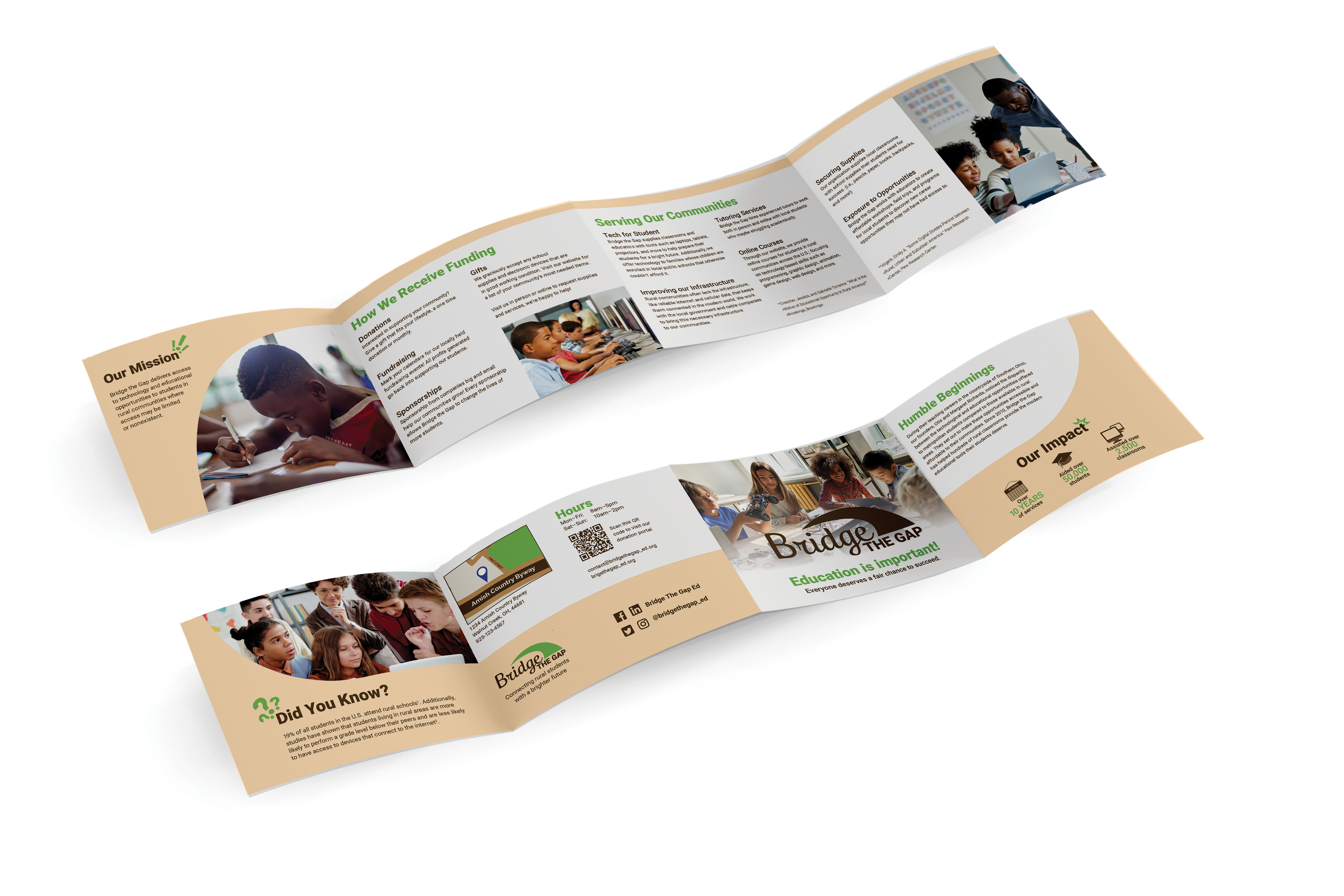
The Bridge the Gap double gate fold brochure is designed to be simple, modern, and portable, allowing us to reach more families, classrooms, and students with our messaging. It explains our services and how funding is received. Also, it showcases examples of how we can help students. The curve seen throughout the brochure represents our core value of connecting children to better education, with curves associated with movement and expansion.
To ensure that viewers can fully understand what services we offer and how we receive funding, we use the easy-to-read font Roboto in our logo and brochure. Our goal is to encourage and support students in reaching their full potential. We believe that better access to technology and the Internet can help them do so.
Bridge the Gap’s aim is to empower students to succeed beyond their current circumstances by bridging the gap in education access. Join us in our mission to provide access to education for every child. Together, we can make a difference in students’ lives in rural communities.
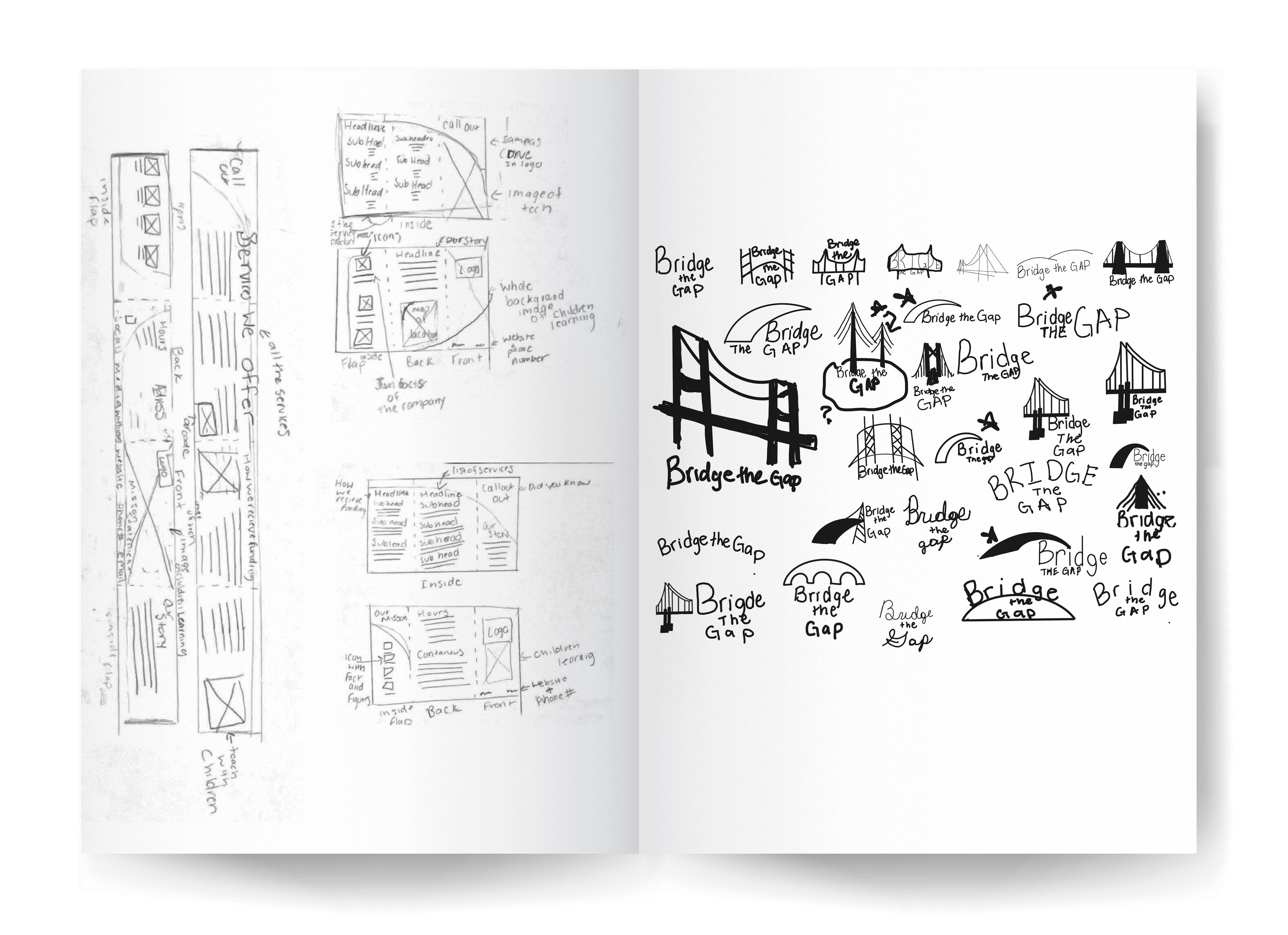
Sketches for Brochure and Logo

The initial Logo
The Final Logo
Color & Type Study

Brochure Version 1


Brochure Version 2


Brochure Final Version


