Nova Theater
UX/UI Design | App & Icons
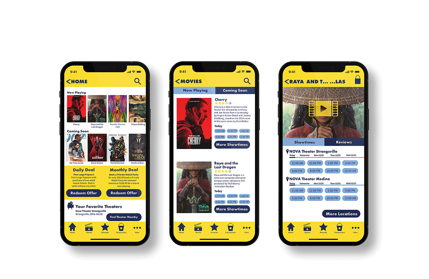
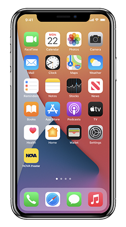
Nova Theater makes the movie-going experience unique and accessible for everyone. Nova theater makes ordering concessions fast and easy and delivers them straight to your seat. Nova offers in-app reviews and ratings for every movie newly released weekly. The Nova Theater logo represents Hollywood actors and actresses who star in the various film Nova shows with the use of the star found in the center of the letter “o.” The app features icons explicitly made for the Nova Theater App for easy navigation. Each icon represents some part of the movie and theater industry.
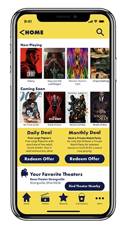
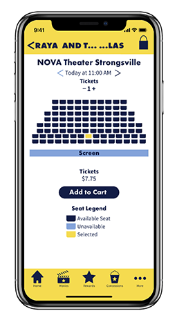
Navy Blue represents the night sky because of the theme of movies and stars. Yellow means the stars in the night sky. Navy Blue and yellow contrast each other and help Nova Theater stand out against its competition because most other theaters use red and gray as their color themes. The typeface of Futura PT Bold and Source Pro Light greatly help create a visual hierarchy throughout the app. With Source Sans Pro featuring various weights. Through user testing, users can navigate easily through the app because of the consistency and contrast found though out each screen. Each screen of the app is layout so that the user can get to their desired location in the app. The app features a static menu in the bottom footer of each screen and a back icon to navigate to the previous screen.


